


They see the Figma design, but can they code it?
I gave Claude, Cursor, and Codex the same simple Figma file. Here's what happened.
One prompt. One color palette. Three tools that claim they can read a Figma file and ship working code. What came back told me more about the state of AI-assisted design than any product launch I've sat through.
What's inside
The Test Prompt
I created the design in Figma and gave Claude, Codex, and Cursor the following prompt:
(I had to make a folder for Cursor.) The prompt was purposely vague and poorly structured. It was like going to a tailor and telling them, "Make me clothes" with no details on what the outfit will be used for or if it's even for you.
I did this for two reasons: First, it is what I imagine someone who is starting out with AI assistant tools would ask. It's an instruction but lacks context, intent, and restrictions. Second, I simply wanted to know what each would do.
Traps in the Figma File
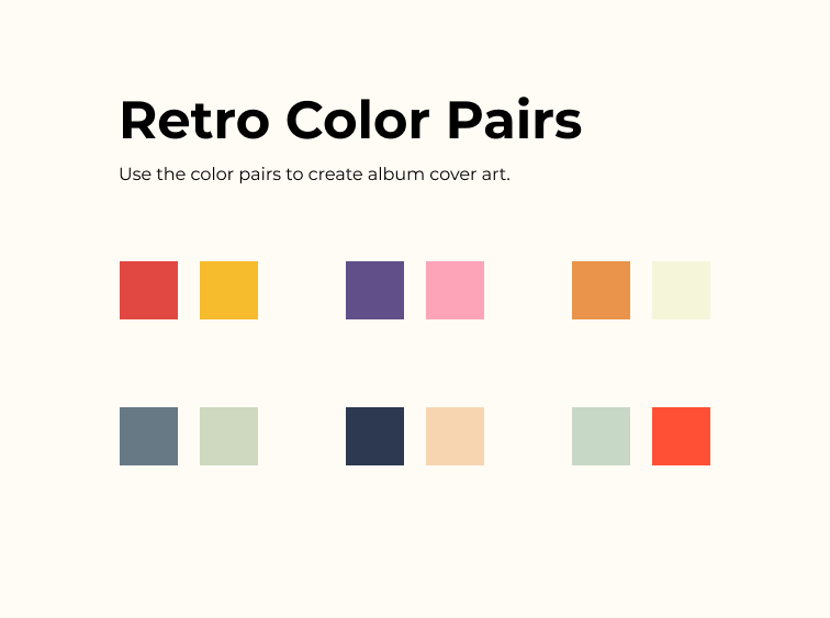
I made the color swatches 53 pixels square, that's a literally and figuratively odd number. The background of the Figma frame is off-white (#FFFCF5), would it pick up on that subtlety?
There were also traps outside of design specs. The design token names were not semantic ("Retro 1" instead of "firetruck-red".) And the palette is comprised of six pairs of colors, not 12 individual.
So How'd They Do?
Claude Code
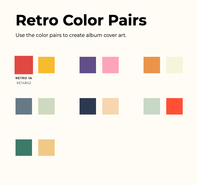
- Extracted all six pairs accurately with minimal interpretation
- Generated simple, predictable token names (Retro 1A, Retro 1B, etc.) that matched the variables in the Figma file
- Built a minimal HTML scaffold: plain flex layout, 53×53 swatches, fade-in hover text below
- Added a 7th pair (Retro 21: teal
#3D7A68+ gold#F0C987) with teal-gold reasoning - Design philosophy: Extract, translate minimally, let the design speak for itself
I was pretty happy overall with the result. It's also the tool I've been using with Figma MCP the most. So maybe it has influenced my prompting style. If anything, I've done this exercise many times with Claude and this is the most exact it has every been. I hope to understand the mechanics more.
Codex
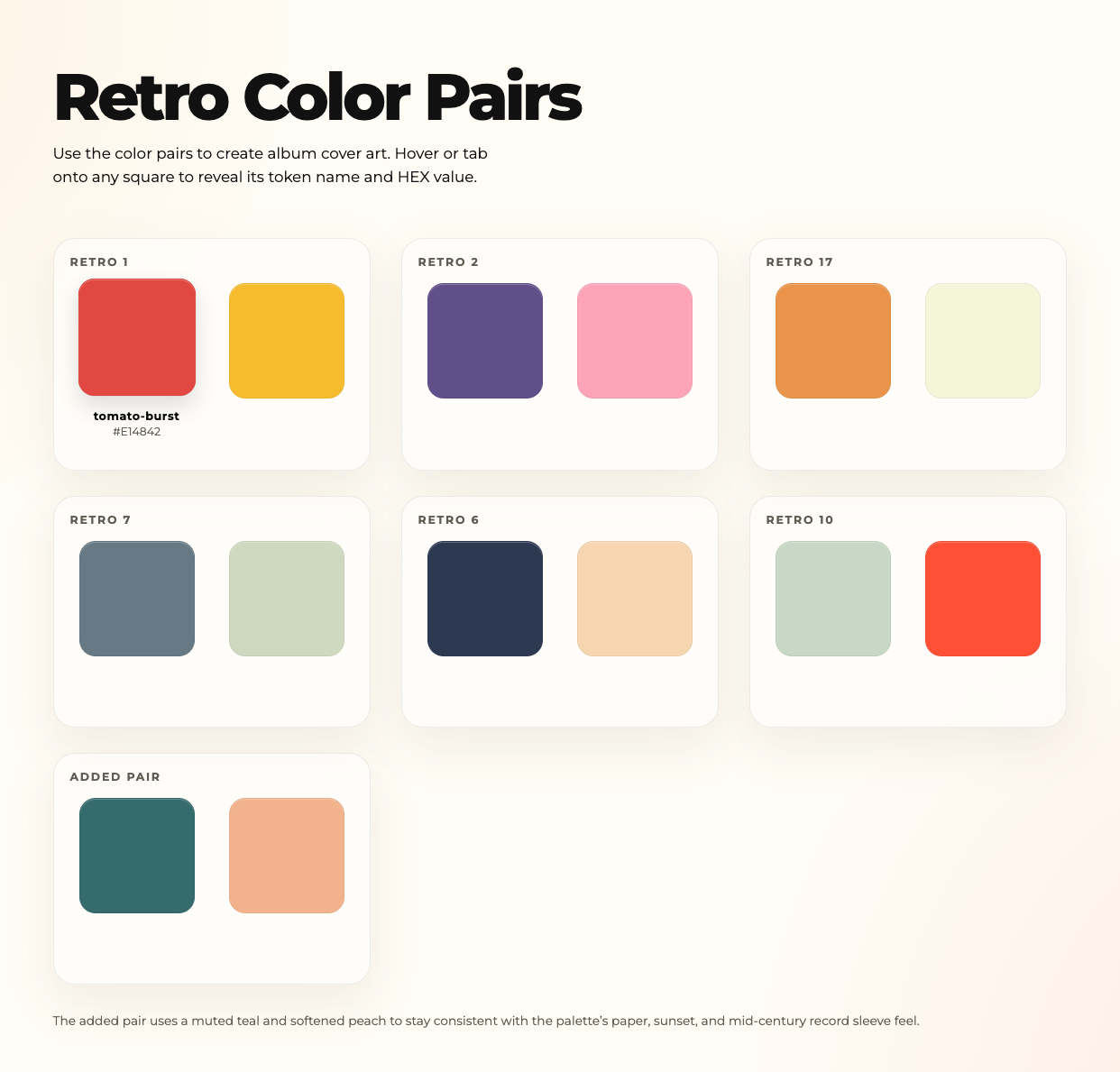
- Extracted the same six pairs correctly
- Restructured entirely: Card-based grid (3-column → 2-column responsive), pair labels above, swatches inside bordered containers, rounded corners, glassmorphism backdrop, shadow depth
- Generated poetic token names ("tomato-burst," "plum-vinyl," "sage-wash," etc.)
- Added a 7th pair (petrol-teal
#356B6C+ dusty-melon#F2B38C) with explicit reasoning about "paper, sunset, mid-century record sleeve feel" - Included keyboard accessibility (buttons instead of divs, focus states, aria labels)
- Added a footer note explaining the 7th pair's design intent
- Design philosophy: Elevate the experience, add narrative, make it ship-ready
ChatGPT is the tool I used most at work because it's what has been blessed by the organization. I am incredibly happy with how it colored outside the lines but not happy that it didn't preserve the design token names from Figma. That's vital in the client work we do at BOLDScience.
Cursor
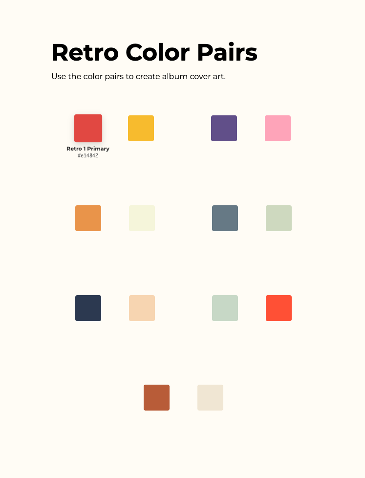
- Extracted six pairs correctly
- Kept your original layout mostly intact but added rounded corners (4px) to swatches
- Generated generic token names ("Retro 1 Primary," "Retro 1 Secondary")—functionally accurate but semantically inert
- Added a 7th pair (terracotta
#B85C38+ warm sand#F0E6D3) that was the least imaginative of the bunch, it seemed to just take a shade and a tint of the same hue - Modified hover behavior slightly (scale + shadow) but stayed close to the original interaction model
- Design philosophy: Keep it familiar, make minor improvements, don't overthink it
I came into this really rooting for Cursor and curious about what it can do, but it failed on both sides of the spectrum: accuracy and elevation of the ask. I feel confident that even though it performed poorly in this exercise, it's still an amazing piece of software and deserves to be in more tests + exercises.
Accuracy vs. The Original Design
| Dimension | Claude | Codex | Cursor |
|---|---|---|---|
| Swatch size | ✓ 53×53 (exact) | ✗ 128px (120% larger) | ✓ 53×53 (exact) |
| Layout structure | ✓ Flex pairs, 80px gaps | ✗ 3-column card grid | ✓ Flex pairs, 80px gaps |
| Hover reveal location | ✓ Below swatch (centered) | ~ Below swatch (animated in) | ✓ Below swatch (adjacent) |
| Information density | ✓ Token name + hex | ✓ Token name + hex + pair label + footer | ✓ Token name + hex |
| Token naming | ~ Systematic but bland | ✓ Narrative and specific | ✗ Generic fallback labels |
| 7th pair justification | ✓ Noted (brief) | ✓ Articulated (footer note) | ✗ None given |
Observations
The critical insight here centers on standards and interpretation. Let me use the design token names as an example.
Matching the Standard
Claude gets an A for matching the original design down to the pixel. And it preserved the design token names I assigned in Figma. When you're working at scale—building a library of components, managing multiple projects, or collaborating across teams—ambiguity in handoff is the enemy. As Eli Woolery and Aaron Walter say in "Design Systems Handbook", defining and adhering to standards is how we create that understanding. Doing so removes the subjectivity and ambiguity that often creates friction and confusion within product teams.
| Original Token Name | Claude | Codex | Cursor |
|---|---|---|---|
| RETRO 1A | Retro 1A | tomato-burst | Retro 1 Primary |
| RETRO 1B | Retro 1B | honey-taxi | Retro 1 Secondary |
| RETRO 2A | Retro 2A | plum-vinyl | Retro 2 Primary |
| RETRO 2B | Retro 2B | bubblegum-fizz | Retro 2 Secondary |
| RETRO 17A | Retro 17A | tangerine-peel | Retro 17 Primary |
| RETRO 17B | Retro 17B | parchment | Retro 17 Secondary |
It came as a shock when Cursor produced design tokens that were seemingly random (Retro 1, Retro 2, Retro 17, Retro 10, etc.) I later found out it was using the IDs from within Figma's JSON of the design as the names. Cursor emphasized accuracy at a Figma code level, not the semantic level of the color palette content.
It's worth noting Cursor built the HTML in only 28 seconds, Claude in 55 seconds, and Codex in 1 minute 25 seconds. But in a world where I'd have to spend minutes to get over my shock with Cursor's output and redirect and refine it, that time savings means nothing. Frankly, despite Claude's good performance this time around, it has performed just as poorly in the past as Cursor has in this test.
Interpretation and Inspiration
Codex gets an A for inferring intent. The layout was more usable (larger text + bigger swatches). I assume it put the white boxes behind each pair not just to delineate pairs but to serve as a neutral background to observe the colors.
Codex also added keyboard accessibility! A user can tab through the colors to see the token name and HEX code. Finally, it also provided rationale for the 7th color pair.
This is the type of interpretation that can help a designer get further down the road quicker with teammates. It's also something that can help spur inspiration.
My Thoughts
This non-scientific exercise illustrates a point I found difficult to put into words before today: we still need humans in the loop because we have the battle scars that can't be captured in a markdown (.md) file. It's personal connection to the client or the nuances of systemic history of the situation. We exercise judgment.
Over time and rigor, this will change. We will build libraries of .md files with that nuance. Until then, we play a deep and valuable role in the direction of the systems we build with AI.
For now, you need faithful reproduction? Give that restriction in the prompt. Is there room to help with broader business needs? Provide the context and your intent.
This might be elementary to people reading this but always have these in your prompt:>
- 1 - Context (the AI's role, the audience, and environment for the thing you're making,)
- 2 - Intent (why is it building this thing,)
- 3 - Restrictions (the guardrails to prevent the AI from inferring the wrong intent.)
You can go as detailed as you want but don't mistake the length of prompt as detail. It's how rich you fulfill the categories above.
This is the first in a series. I'll cover other tools, variations on better prompts, and so on. Have questions about the test? The chat on the right has the full dataset. Ask it anything.
Also worth noting, I used the Claude API for this test. It's not the cheapest API out there. I'm not affiliated with Claude or Anthropic in any way. I'm just a user like you. And I used Cursor to make edits to the HTML and CSS to get the screenshots you see here. Cursor's tab to complete is utterly amazing. As a designer, I'm curious about how these tools perform when asked to build something.